
Colour analysis has become hugely popular online. There are filters, AI apps, quizzes and consultants offering virtual analysis from a photograph, often promising to identify your colour season without ever seeing you in person.
But I'm now seeing more clients come to me after a colour analysis that simply doesn't feel right.
They've tried wearing the colours they were given. They've bought new clothing, changed their makeup, even avoided shades they used to love, only to feel washed out, overwhelmed or more confused than they were before. Sometimes they start questioning whether colour analysis works at all. And sometimes they wonder whether there's something wrong with them, because the palette they were told was perfect doesn't seem to work.
Usually, there's nothing wrong with the person. The analysis simply missed something important.
Why Colour Analysis Is Easy to Get Wrong Online
Analysing colour through a photograph is incredibly difficult, because so many things affect what shows up on a screen.
Lighting can make your skin look warmer, cooler, brighter or more muted than it really is. Phone cameras automatically adjust colour and exposure. Filters, shadows, fake tan, makeup, hair colour, clothing, even the colour of the wall behind you can all influence the result. Then the device viewing the photo shifts the colours again.
So an online analysis may be based on a version of your colouring that isn't actually accurate.
Colour analysis is also not as simple as glancing at someone's hair and eyes and deciding which season they belong to. Two people can have very similar hair, skin and eye colouring, and respond completely differently when the same colours are placed near their faces. The only way to see what a colour is really doing is to test it directly against the person.
Your Hair and Eye Colour Don't Decide Your Season
One of the biggest misconceptions in colour analysis is that certain combinations of hair, skin and eye colour automatically belong to a particular season.
Blonde hair doesn't mean you need light colours. Dark hair doesn't automatically mean you can carry strong, high-contrast colours. Blue eyes don't always mean you're cool, and brown eyes don't always mean you're warm. Your current hair colour can be misleading too, especially if it's dyed, highlighted or quite different from your natural shade.
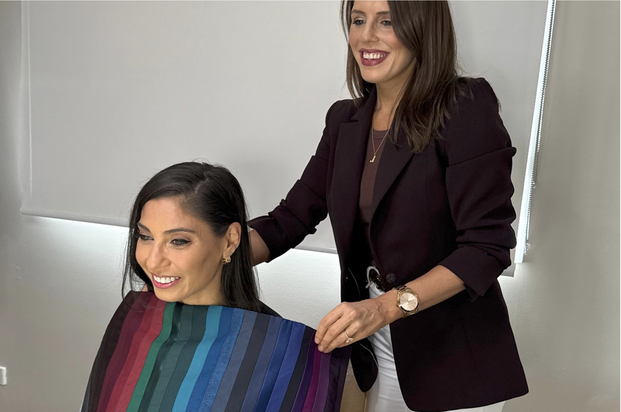
This is why guessing a season from someone's appearance alone so often leads to the wrong result. During an in-person analysis, I'm not deciding what I think you should be. I'm watching how your skin visibly responds as different colours are placed beneath your face.
The Right Colours Should Harmonise With You, Not Just ‘Pop’
People often assume the best colour is the one that makes their eyes stand out or creates the biggest reaction. But a colour ‘popping’ isn't always a good thing.
Sometimes a colour is the first thing you notice because it's too strong, too bright or too contrasting. Instead of supporting you, it takes over.
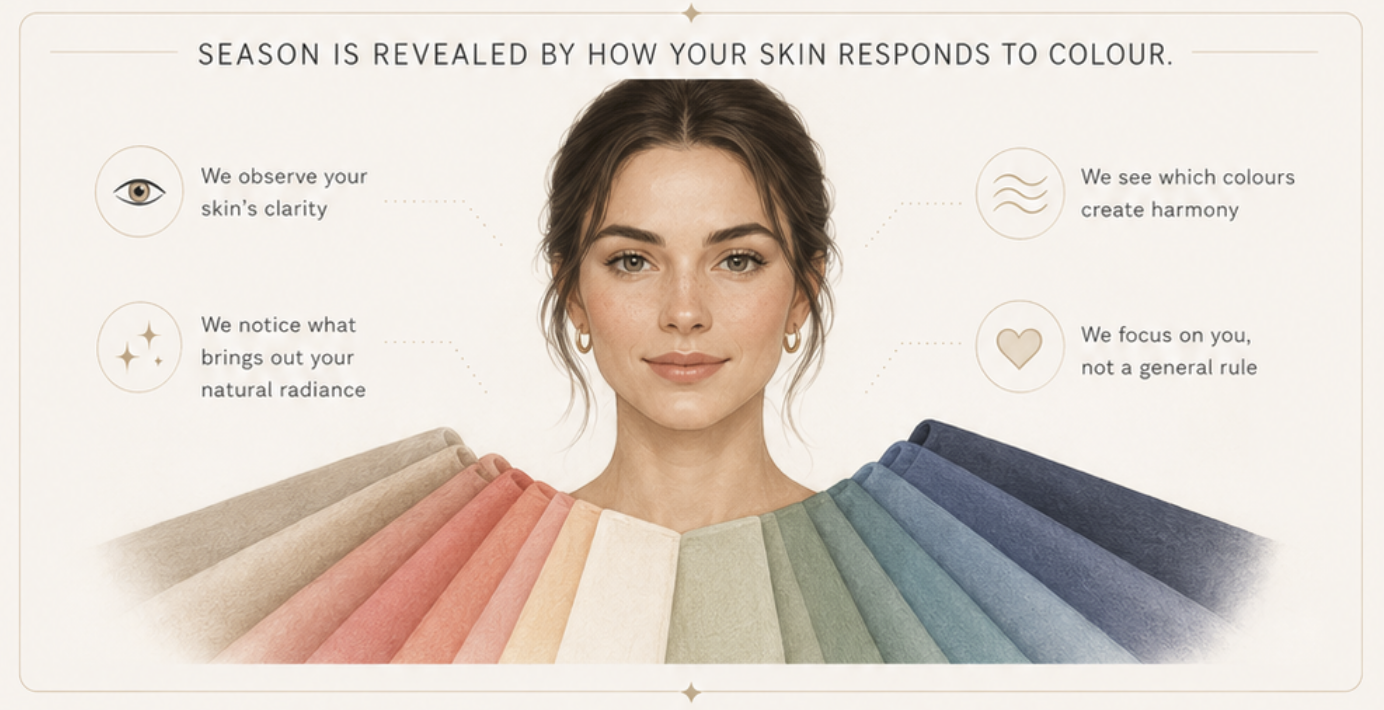
The right colours harmonise with your natural colouring. Your skin looks healthier and more even. Your eyes look clearer. Redness, shadows and discolouration soften. Most importantly, you notice the person before you notice the colour. You still look like yourself, only fresher, healthier and more balanced.
What Professional Colour Draping Actually Reveals
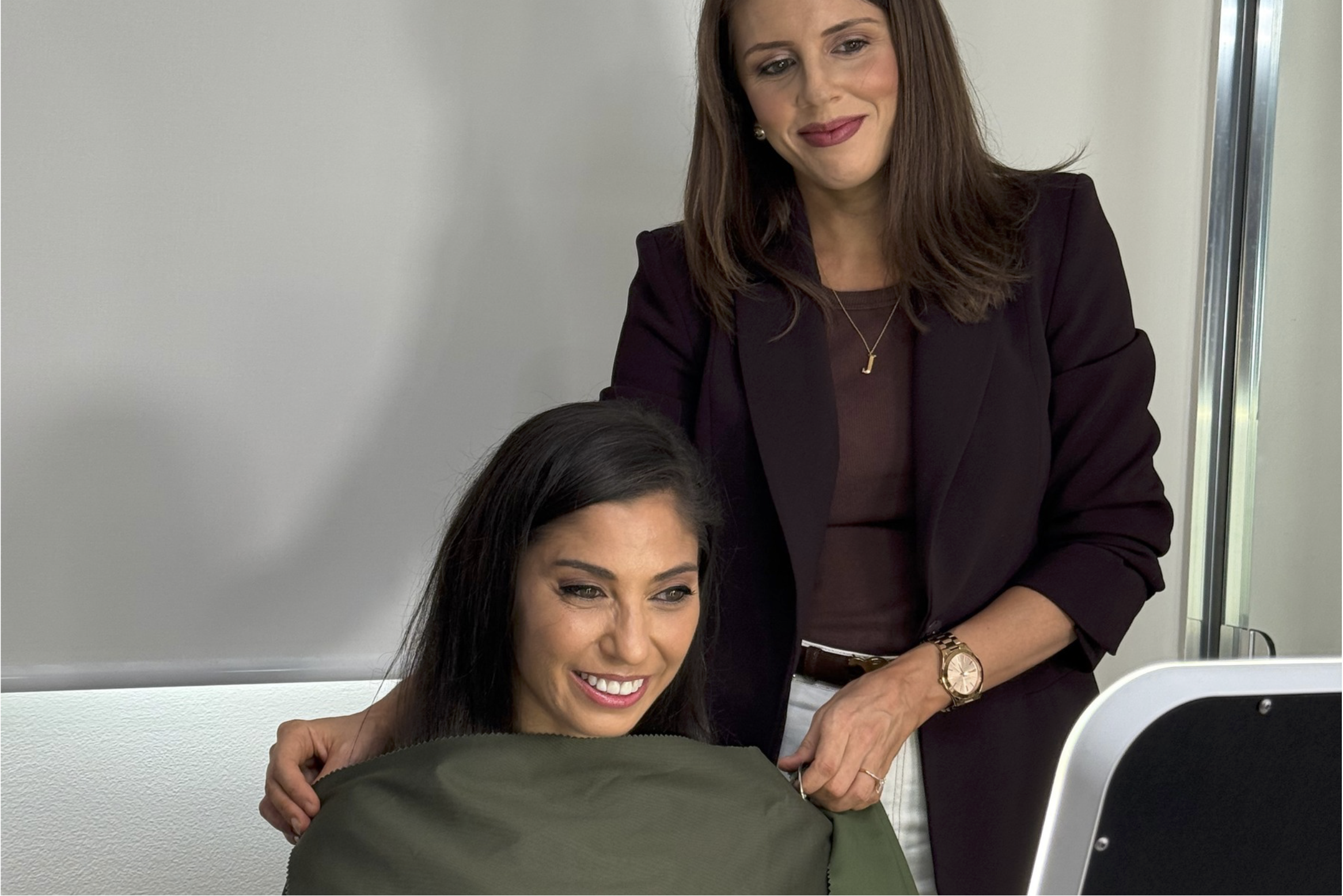
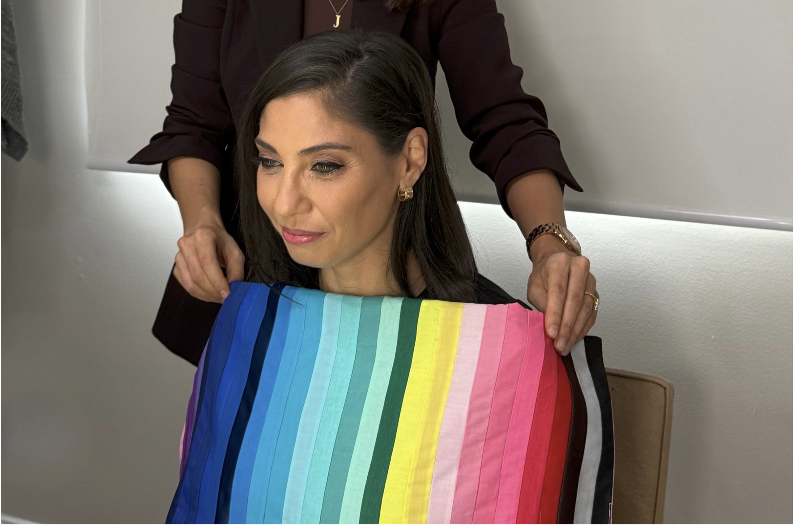
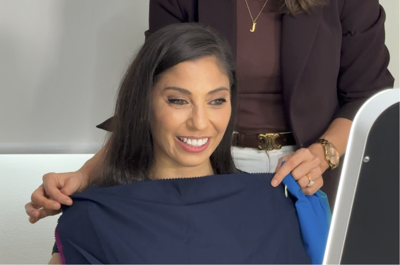
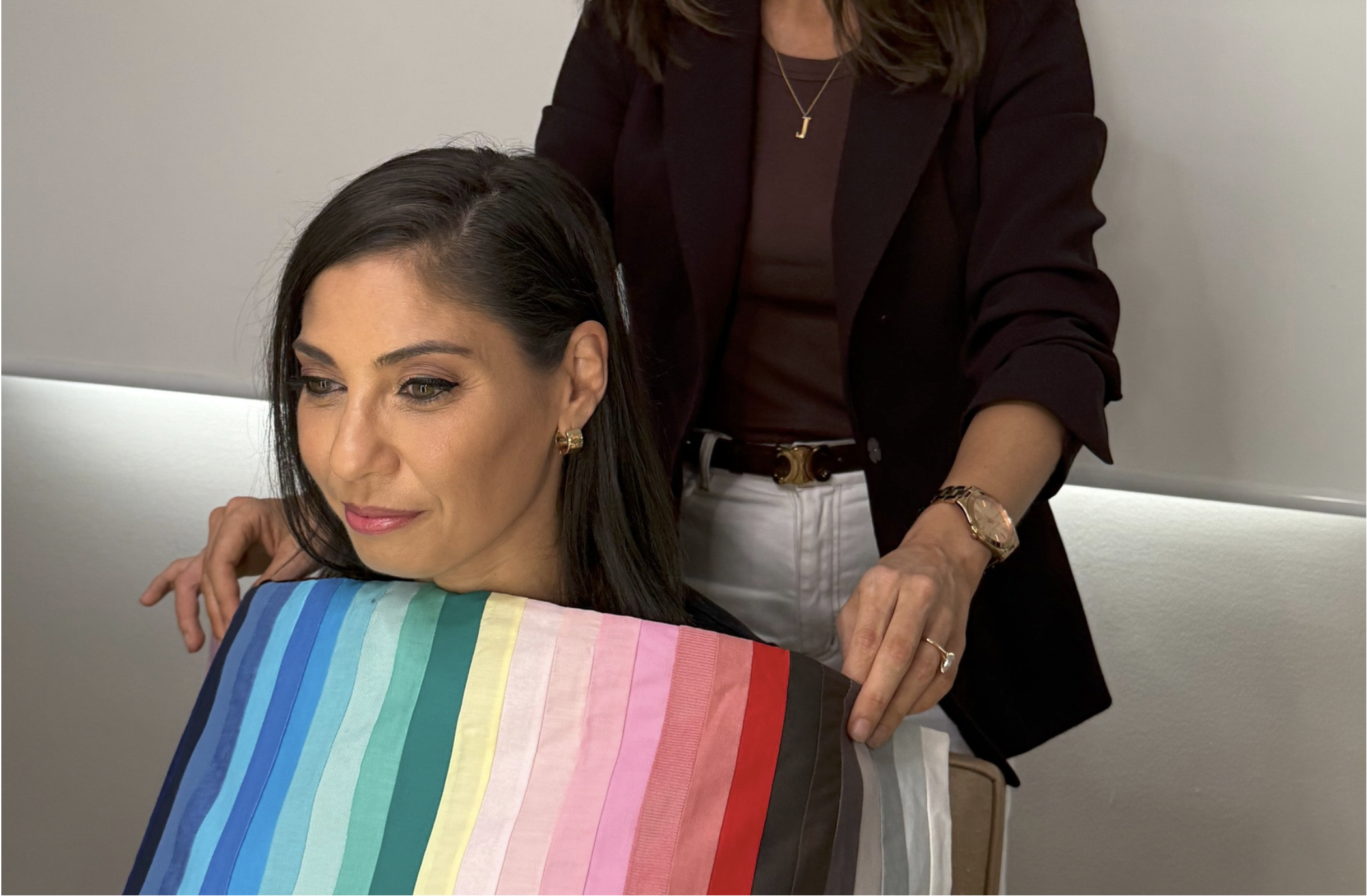
During an in-person analysis, I use professional drapes to compare different colour characteristics directly beneath your face.
We test whether your complexion responds better to warm or cool. We compare light and dark, clear and muted, and look at how much contrast your natural colouring can comfortably carry. This matters because colour is rarely as simple as warm or cool. You might suit cooler colours but be overwhelmed by icy shades. You might need softness, yet find dusty tones drain you. You might have warmth in your colouring and still struggle with strong oranges, yellows or earthy browns.
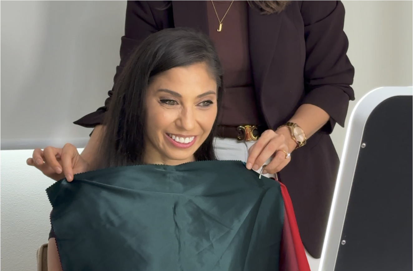
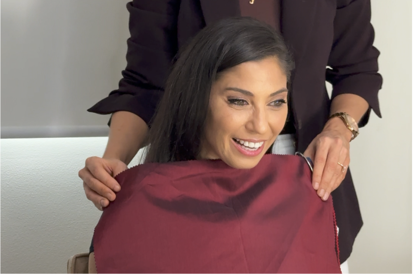
You may even discover your best palette sits somewhere between the rigid examples you've seen online. That's the nuance a photo or a quick seasonal quiz can miss. Draping lets us compare colours properly and see the differences as they happen, instead of relying on assumptions.
A Colour Season Is Only the Beginning
Being given a seasonal label can be helpful, but it shouldn't be the only thing you walk away with.
You also need to understand your best neutrals, your strongest colours, the shades that work near your face and the level of contrast that suits you. Not every colour within a season is equally flattering. There may be certain blues, greens or pinks in your palette that are incredible on you, while others technically in the same season feel dull or overpowering.
Your palette should make shopping easier. It shouldn't become another complicated set of rules that leaves you afraid of wearing the wrong thing.
Signs Your Current Colour Palette May Be Wrong
Your palette may need reassessing if you consistently feel washed out, dull, tired or overwhelmed in the colours you were given.
Other common signs: you need more makeup to feel balanced, the colours don't work with the rest of your wardrobe, or you keep reaching for shades outside your recommended palette because they feel more natural on you. Often you understand the palette in theory, but never actually wear it.
Adjusting to new colours does take time, and it's normal to feel unsure when you move away from shades you've worn for years. But if a palette still feels wrong after you've genuinely given it a go, it's worth trusting that instinct.
The Wrong Palette Becomes an Expensive Mistake
Colour analysis is meant to stop you wasting money, not send you out to replace your whole wardrobe with colours that don't make you feel good.
When the analysis is off, people start buying new tops, jackets, makeup and accessories to try to make the palette work. The pieces coordinate with the swatches on paper, but they still don't feel right when worn. That's exactly why getting your colours properly assessed matters. The goal isn't a pretty set of colour cards. It's practical information that helps you make better decisions when you shop, build outfits and choose clothes you'll actually keep wearing.
Have Your Colours Professionally Rechecked In Person
If you've had a colour analysis but your palette still feels off, it doesn't mean colour analysis doesn't work. It may just mean your colouring needs to be assessed more carefully, and in person.
A professional in-person analysis removes the guesswork. We compare colours properly and build a palette that reflects how your complexion truly responds, so getting dressed and shopping feel easier, not more confusing.
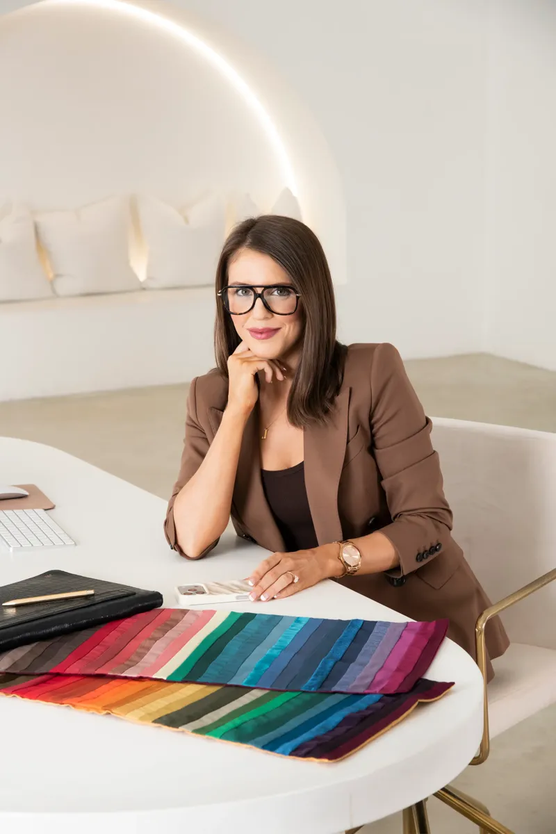
Book an in-person Colour Analysis with Josephine Eve in Sydney and discover the colours that genuinely work with your natural colouring.
Frequently Asked Questions
Not reliably. Lighting, phone cameras, filters, makeup and even the wall behind you change how colour reads on a screen, and the device viewing it shifts things again. The only way to see what a colour truly does is to test it directly against the person in person.
Usually there's nothing wrong with you. An online or quiz-based analysis may have been based on an inaccurate version of your colouring, or it relied on your hair and eye colour rather than testing how your skin actually responds to different colours.
Colour draping is placing professional colour drapes beneath your face to compare warm against cool, light against dark, and clear against muted, so we can see exactly how your complexion responds and find the palette that harmonises with you.
No. Blonde hair doesn't mean you need light colours, dark hair doesn't automatically suit high contrast, and eye colour alone doesn't make you warm or cool. Two people with similar colouring can suit very different palettes.
Common signs are feeling washed out, dull or tired in your colours, needing more makeup to feel balanced, the palette not working with your wardrobe, or understanding it in theory but never actually reaching for it.